Print culture and magazine identity
Print culture and recurring visibility
Mucha matters in print culture not only because he designed for magazines and publishers, but because he understood repeated visibility as a form of cultural authority.
More than a single poster
It is easy to think of Mucha through singular poster icons, but print culture works differently. A magazine title, a periodical poster, or a recurring editorial surface depends on repetition. The image returns, circulates, and settles into public memory through cadence rather than one spectacular encounter. In this field, authorship is not proved by the uniqueness of one masterpiece. It is proved by the ability to remain recognizable across repeated contact.
Periodicals as style infrastructure
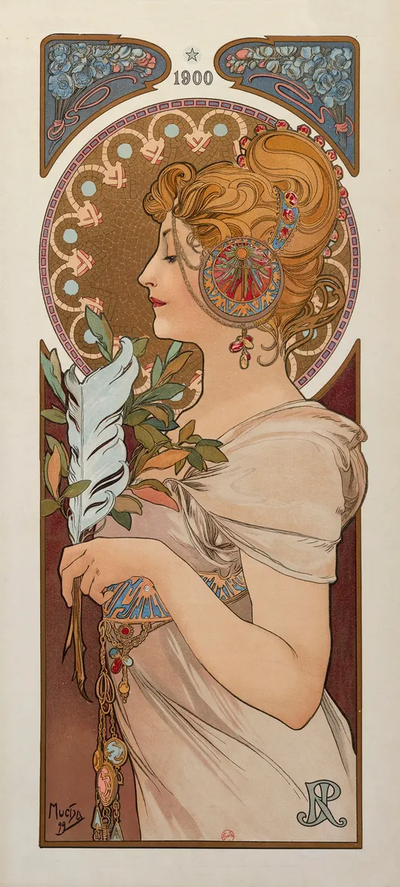
La Plume shows how Mucha could give a publication a monumental face. Cocorico magazine title illustration proves that the same authority could also work in a lighter and wider format. Soleil du Dimanche belongs to that same ecosystem of recurring contact, where urban readers do not just see an image once; they learn to recognize a visual tone attached to a title. Print culture is therefore not secondary to poster culture. It is one of the infrastructures through which a style becomes habitual and socially legible.
Continue reading
More in this reading route
Related works
 5 explained symbols
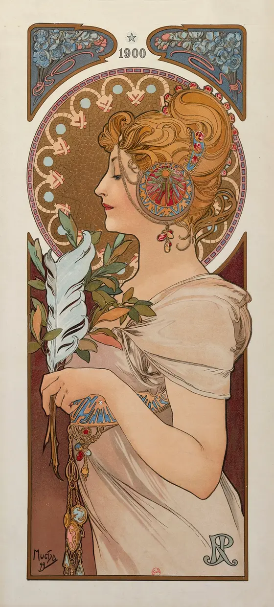
La Plume
A magazine and print institution given a tall, almost iconic public face through Mucha's poster language.
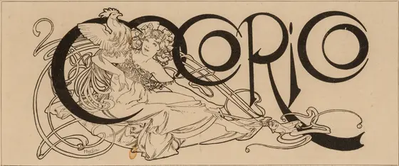
Cocorico magazine title illustration
A wide title illustration in which the magazine becomes a playful yet confident emblem of image culture and editorial identity.
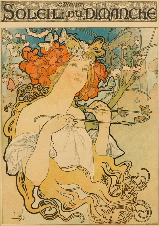
Soleil du Dimanche
A Sunday paper or cultural title turned into a vertical image of lightness, circulation, and urban readability.