Click the artwork or use the button below. Zoom with the wheel, jump in with a double-click, and drag to pan without any download flow.
Short object reading
Object note
This page stays close to the sheet itself: composition, historical setting, and the work's place in the archive.
Visual reading
The horizontal format matters here. Instead of a tall iconic figure, Mucha organizes editorial identity across width, rhythm, and quick legibility. The work feels lively, but it is still controlled enough to function as a mark of prestige.
Historical role
This is useful evidence that Mucha’s public language was not limited to monumental poster verticals. He could also shape the face of a magazine through a lighter, faster register that still carried unmistakable authorship.
Archive note
In the archive, Cocorico expands the publishing branch beyond posters and shows how magazine culture helped circulate Mucha’s style through recurring printed surfaces.
Go deeper
Related essays
These essays step back from the sheet and open the broader argument around medium, public role, and curatorial context.
Related works
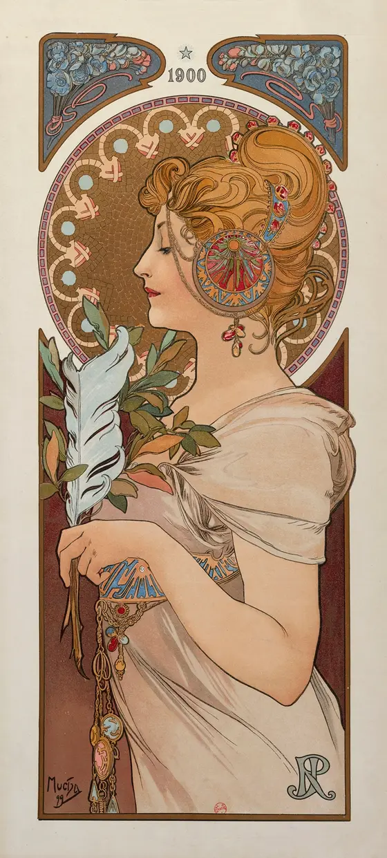
La Plume
A magazine and print institution given a tall, almost iconic public face through Mucha's poster language.
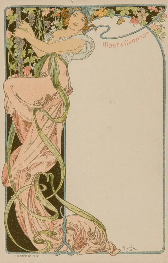
Menu Card
A small print format showing that even a menu can carry prestige, ornament, and publicly shared style in Mucha's hands.
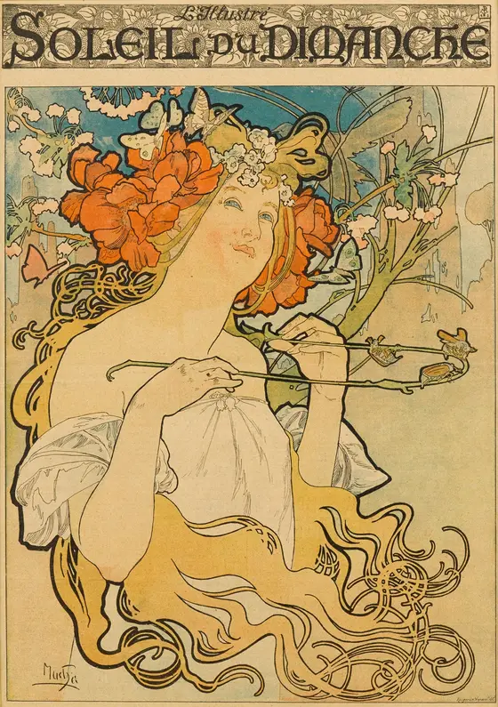
Soleil du Dimanche
A Sunday paper or cultural title turned into a vertical image of lightness, circulation, and urban readability.